11 Bubble chart
The bubble chart, which is found in the “Bubble” sub-tab of the “Explore” tab group, is a powerful tool to compare the relationships between indicators and aggregates. Effectively it is a scatter plot between two variables, but can also map a third variable to the size of each point, and a grouping variable to the point colours. Note that colour mapping will only be enabled if you have entered a grouping variable with your input data.
The sidebar gives various controls. The first six dropdown menus control which indicators or aggregates to display on the plot: the x and y variables, plus size and colour.
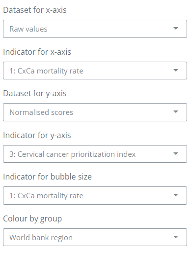
Notice that for the x and y variables you can also select the data set: here, selecting “Raw values” will show the indicator values before any treatment, normalisation and so on. These are, in other words, the “real” measured values. The “Normalised scores” are instead the indicator values after any data operations, AND normalised. For aggregate variables (e.g. the index, dimension scores etc.), you must select “Normalised scores” since these variables only exist as scores and not as raw (measured) values.
After selecting the variables of interest, click the “Run” button. The plot will show the selected variables, and will also include two “threshold” lines which can be moved using the settings in the side panel. These are intended to be used to illustrate units that have passed certain significant thresholds (the meaning will be dependent on the selected indicators).
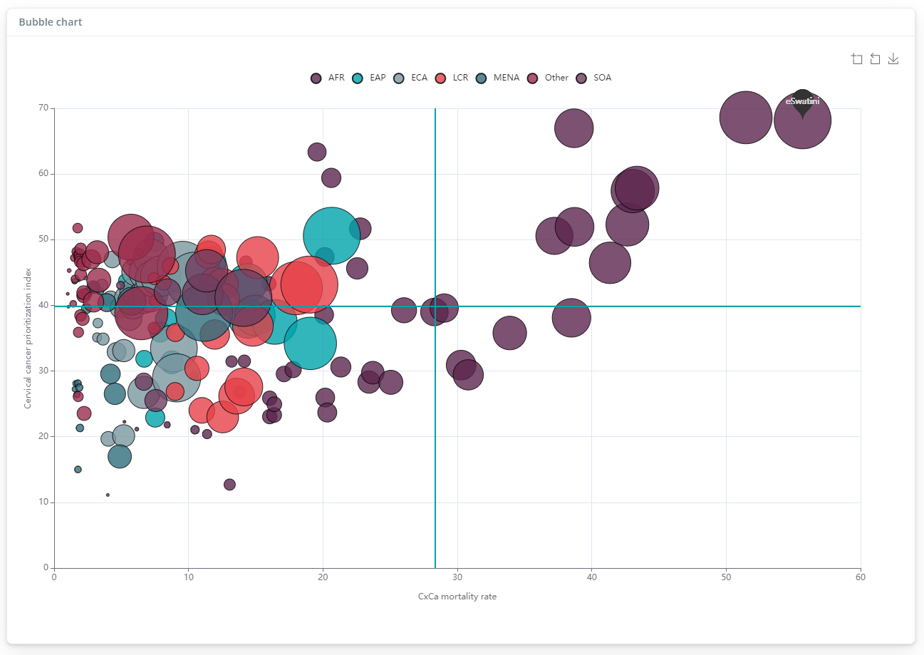
The bubble plot is interactive: hovering over points will momentarily filter to points of the same group. Clicking on the legend entries also allows to filter in/out each group. You can also zoom in and out and download the image using the controls in the top right.
Further controls on the bubble plot include:
- Switches to enable log axes for the x and y axes
- A switch to enable and disable the threshold lines and set their values
- A “Highlight units” box, which can be used to select a subset of units to highlight on the plot