10 Maps and bar charts
Maps and bar charts can be used to visualise the scores of the index, or any indicator or aggregate. Maps give a quick overview of spatial patterns (for example, which continents have higher or lower scores), whereas bar charts are more useful for giving a precise comparison and ordering of scores.
10.1 Maps
Maps can be generated in the “Map” sub-tab in the “Explore” dropdown menu in the navbar. As mentioned elsewhere, maps can only be plotted if your input data is at the country level and uses ISO alpha-3 codes as its “iCodes” (see again Chapter 4). Otherwise, the map will be disabled.
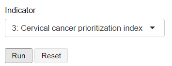
To plot a map, simply select the indicator or aggregate of interest from the dropdown, and click “Run”. The dropdown menu here is sorted by the highest level downwards.
This will generate a choropleth map which is a world map where the colour of each country represents its score or value in the indicator.
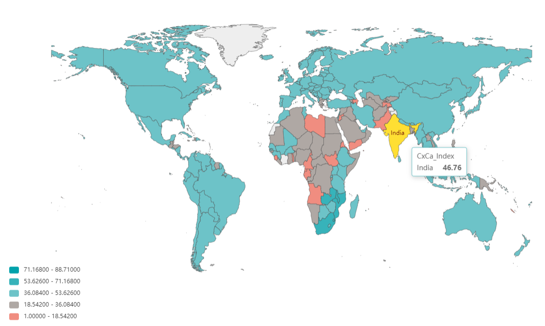
The map is interactive, so hovering over a country will give details about its score. Hovering over the legend will highlight the countries in that score group, and clicking on legend entries will exclude or include countries within that range. The map can be zoomed and panned by using the mouse scroll wheel and by clicking and dragging, respectively. The map image may also be downloaded as an image using the download icon in the top right of the map window. You can also expand the plot window by clicking the expand button in the bottom right.
Country borders are disputed in some areas can be politically sensitive. Always be aware of the environment that maps are presented in!
10.2 Bar chart
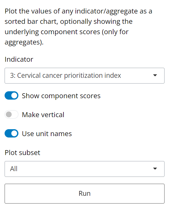
The bar chart displays the same kind of information, but wsithout the spatial component. On the “Bar” sub-tab, select the indicator or aggregate to plot, then click “Run”.
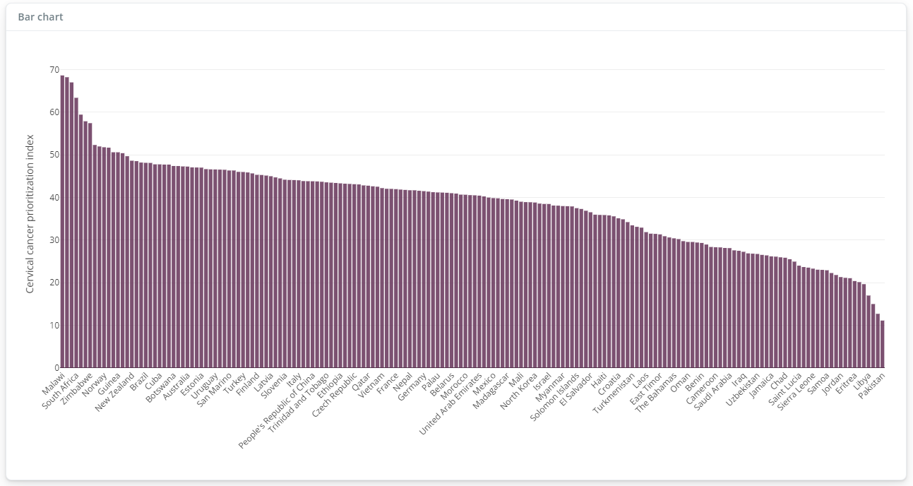
The resulting bar chart in the main window will be sorted from the highest score downwards. The bar chart is also interactive and can be zoomed and panned.
Note that if an indicator is selected to plot (i.e. from level 1), the bar chart will display the raw data, as it was input into the app. If an aggregate is selected, i.e. from level 2 upwards, then it will be displayed as a score. In this case, it is also possible to display the component scores for each country, as “chunks” of each bar, by clicking the “Show component scores” switch.
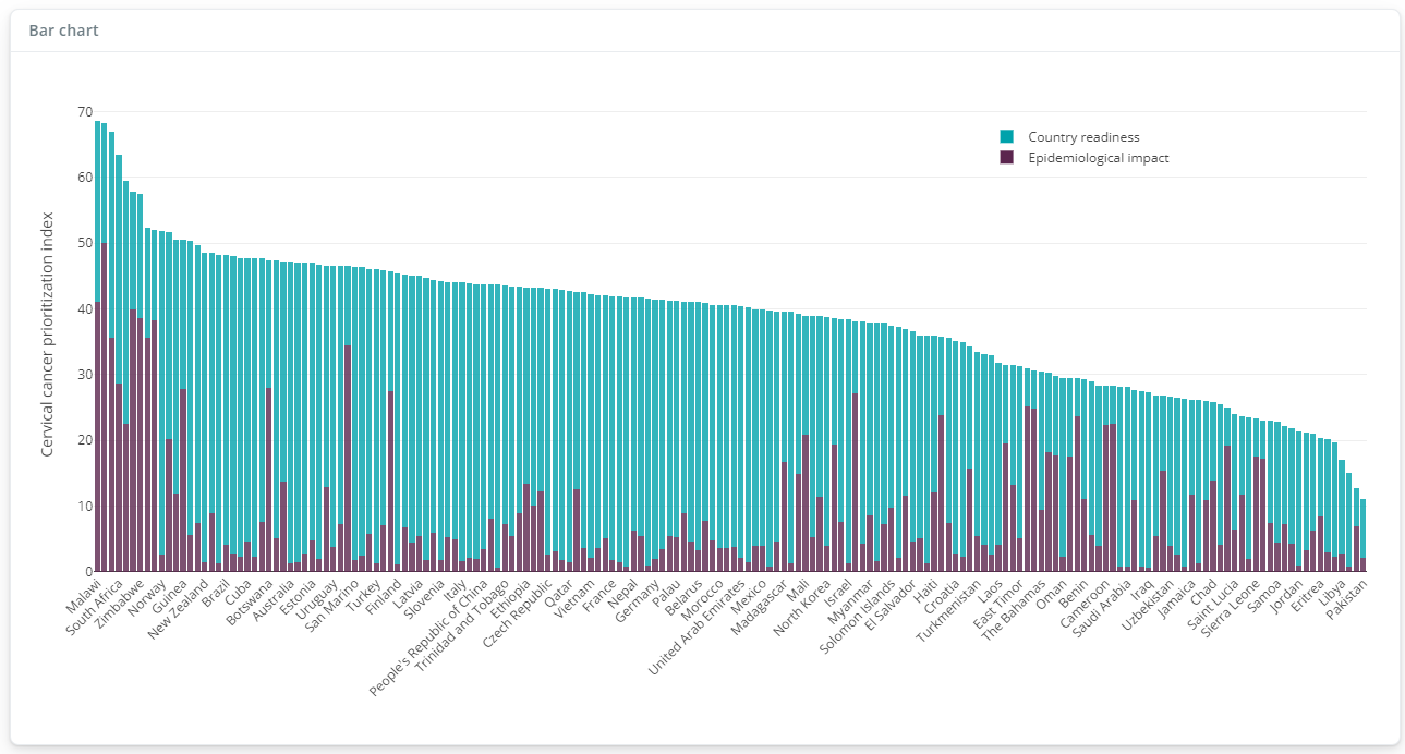
In the example here, this gives an idea of what is contributing to each score. Clicking on the legend entries will also add or remove each group from the plot.
The remaining switches allow the bar chart to be flipped to vertical (this can be be useful depending on the number of units and the length of names), and to toggle between unit names and unit codes. You can also select to plot a subset of the units, for example top 50, which can be useful when the number of units is quite large.